
What you’ll find on the Demographics Page:
- Overall district enrollment
- Enrollment of students eligible for free or reduced price lunch
- Enrollment of students eligible for special supports and services including students experiencing homelessness, emerging multilingual students, students in special education, students in gifted & talented programs, and students in online programs.
- Enrollment of students identifying as a specific race or ethnicity
Why We Care
Student populations vary across the state, which can result in different federal dollars, challenges, and opportunities for school districts. This impacts the resources that schools need, the skill sets required of teachers, and helps us understand which districts are really supporting all students. We encourage you to dig into these dashboards to see which districts are serving different student populations.
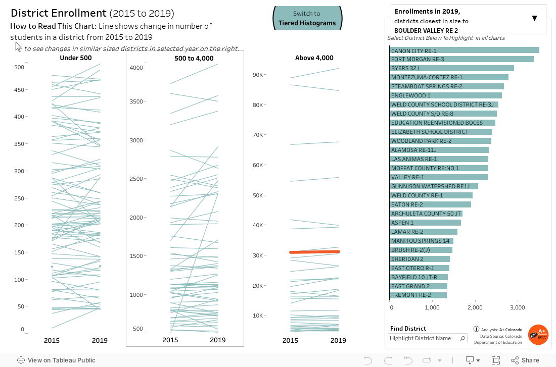
How to Read This Chart
This dashboard shows district enrollment in each district, including the change from 2015 to 2019. In the middle of the page, you see three charts that explore changes in overall enrollment in small districts enrolling fewer than 500 students, mid-size districts enrolling 500 to 4,000 students, and large districts enrolling more than 4,000 students.
Click “Switch to Tiered Histograms” to get a better sense of the range of district sizes in terms of student enrollment across the state.
The right side of the dashboard shows the overall enrollment and changes in enrollment in districts similar in size to the district selected in the main chart. Click the drop down to learn more about the enrollment of students eligible for free or reduced price lunch. You can also find a search bar to select a particular district.
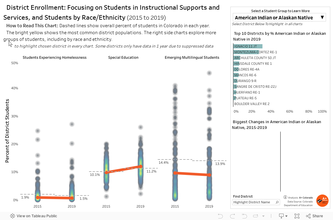
How to Read This Chart
In this dashboard, you can dig into enrollment by instruction programs or support services. The charts in the middle of the page show the percent of students in each district who are experiencing homelessness, who are in special education, or who are emerging multilingual students. The charts show the range of experiences across school districts, and how these student populations have changed in the past five years.
On the right side of the dashboard, select different student groups who are receiving specific programming or supports, or students identifying as a specific race or ethnicity. The charts will show the districts serving the largest proportions of the selected student group, and will show the districts who have seen the biggest changes in the selected student group over time.
Explore more information about: