Reviewing the latest distribution of colors from the Denver Public Schools (DPS) release of the 2017 School Performance Framework (SPF), you would think that DPS made the biggest improvement of any school system in the history of American public education in just one year, where the district went from identifying 1 in 7 elementary schools as very low performing (red) to 1 in 30 elementary schools as that same rating.
The truth is that Denver has made some remarkable improvement in terms of getting students to master grade-level content. And the 2017 SPF seems to overstate this improvement to families. Denver students’ achievement, as measured by Colorado Measures of Academic Success (CMAS) scores, increased for nearly every group of students since 2015 when the tests were first administered (there has been some stagnation and declines for students on Individual Education Programs (IEPs) in some subjects). This mirrored a decade-long trend of improvement over the previous decade. This is great news. But does it mean that most DPS schools are now “good”? Particularly when we remember how far as a system we still have to go?

Where did the red schools go?
This year, the DPS School Performance Framework rated 10 schools as red. In 2012, 2013, 2014, and 2016 (no SPF was released in 2015 due to assessment shifts) there were 30-32 schools that received that rating. Yes, achievement has improved more in Denver than any other large school district in Colorado over the last decade for all groups of students. And this shift in school ratings does mirror the State’s SPF (which we also have concerns regarding), which also rated far fewer Denver schools as Turnaround this year as in previous years. That said, my concerns with Denver’s SPF are separate, because—more so than any other school district in the state—DPS relies on the SPF to make important decisions and communicate school quality to families. Further achievement is still far too low to support most DPS students to be ready for college and a career in the 21st century.
For example, the district’s own goal is that 80% of all 3rd graders will read on grade level. In 2017, only 1 in 5 low income students were reading at grade level in 3rd grade, an improvement from 1 in 6 low-income 3rd graders at grade-level in 2015. Improvements like this are incredibly important, and should be celebrated, but are not nearly as dramatic as the level of improvement seen in SPF ratings.
While DPS’ SPF does include many measures across two years, there appears to be a disconnect between the underlying data and Denver’s school ratings.
Most of the schools that were red multiple years and faced the prospect of drastic action this year have bounced right off that list. Did they really make such dramatic improvement? According to our analysis, not all have. What is the district’s plan for these schools? How do we balance huge gains in SPF ratings when so many students are still in schools that continue to produce such low proficiency scores and growth?
This has enormous implications for the Denver system moving forward. With fewer red schools, will the district not take turnaround or restart actions in schools where performance is still so low? Are dramatic interventions not needed in these schools? How can DPS reasonably convince a newly green school community with low proficiency that dramatic changes are needed? With this year’s SPF results, DPS needs to be able to publicly articulate how it will improve its most challenged schools.
What happened to the School Performance Framework?
DPS started using the SPF back in 2009 primarily as an internal metric for determining the quality of schools for management purposes. It quickly became the indicator for school quality when it was included with the district’s enrollment guide in 2012.
Denver, more than most other school districts, has used the SPF, internally, to manage schools and, externally, to signal to families what is a good school. It has driven most decisions about human capital, school turnaround, new school authorizing, and resource allocation.
While the SPF overall has been a powerful tool for district improvement, it has also become increasingly complicated, used for too many purposes including resource allocation, accountability, and communicating quality schools to families.
In 2015, a large coalition that included schools, foundations, and education nonprofits asked DPS to update the SPF, raise the bar, and be more accurate in pinpointing effective schools. The district responded by making some modifications but did not change the emphasis on growth to proficiency (3:1) or many cut points that the coalition believed to be too low. There were additional concerns and suggestions for how DPS might improve the SPF in a ramble blog post, The Mismeasure of School after the 2016 SPF release. DPS responded by hosting a series of focus groups, yet there was no reporting back to any of the participants– or more importantly, the community– about how the district would respond to these and other concerns.
What does it mean to be “Green”?
The DPS definition of “Green” is a “school is doing well but still has some areas of improvement.” It is the second highest ranking on the SPF and is included in the north star of “Great Schools in Every Neighborhood” which sets a goal as 80% of students in Green/Blue schools.
Let’s look a little closer at some of DPS’ green schools. An important question is whether Academy 360, Barnum, Munroe, and several other schools with low proficiency and lower growth, but higher early literacy scores be “Green?” There are measures that have shown some improvement in these schools, but it’s hard to argue they should be “Green.” Making schools that have such low proficiency with low growth (MGP) sends a false message to families, and diminishes the hard work that other schools have made in supporting their students to to reach proficiency.
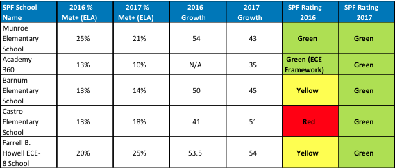
Families need to know the colors are meaningful. There are many former “Red,” “Orange” and “Yellow” schools from 2016 including the “Green” schools in the chart above that have made important improvements. But they should not be designated “Green.” There must be higher floors for achievement and growth than the current SPF requires. DPS must reward and support schools that are improving, and holding the line on what qualifies as a quality school. That one in ten students is reading on grade level while students are losing ground relative to their peers (less than 50 MGP) should not qualify as good.
Early literacy points increase the scores
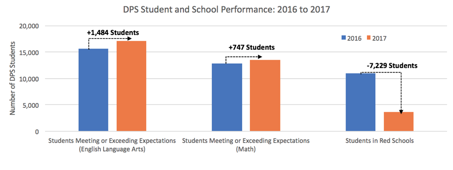
The biggest shift is the SPF ratings was at the elementary level. A 4.7% gain in elementary proficiency on CMAS English Language Arts (ELA) (great news!) does not reconcile with SPF ratings that present an 80% reduction in the number of red elementary schools in just one year. The elementary SPF ratings have improved at a rate that is greater than their performance on CMAS tests would indicate, and that gap in improvement trends is noticeably greater this year in comparison to prior years, as the graph below illustrates.

How did this happen?
First, consistent with the Denver Plan, DPS focused intensely on early literacy, which is laudable. The district has sent a strong signal of the importance of early literacy to achieving longer term academic success for students. Part of this signal included significantly increasing the emphasis that early literacy assessments have on a school’s overall growth and proficiency numbers, in some cases more than doubling its weight on growth and status measures over previous SPFs for that same school.
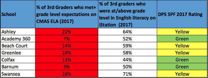
This is a lot more weight on an assessment that is not consistent across the district. School leaders are allowed to select an early literacy assessment from a list of state approved tests and many schools have switched their assessment with 80% of schools now using iStation. This year, amidst this switch of early literacy assessments at many schools, districtwide K-3 students saw an 17-point increase in the percent of kids proficient in the early grades on iStation.
This is a bit of a red flag for me. First it would be highly unusual for students across the district to make this level of improvement (we rarely see large school systems make double digit improvements on reading). It would be great to be proven wrong if CMAS English Language Arts scores go up by double digits in 3rd and 4th grade in 2018, but that seems unlikely based on the information we’ve gotten from that assessment about how students are faring in Denver.
Secondly, there is a disconnect between the expectations on the iStation assessment and CMAS PARCC set by the assessment creators themselves – something DPS itself has acknowledged and already has announced it will fix on the 2019 SPF (in 2 years) through an increase in early literacy expectations. That future change does not change the reality for this—or next– year, however. When comparing results of 3rd graders (the only students who took both iStation and CMAS PARCC), proficiency rates based on assessment cut scores were, on average, around 30 percentage points higher on iStation than on CMAS PARCC. That means the same group of kids scored dramatically better on the early literacy test than on CMAS PARCC—the assessment that is most aligned to our expectations of what students should know and be able to do.
These higher early literacy scores mean that far fewer elementary schools that would have been “Red” in prior years now are rated higher — in many ways signaling that they do not merit any serious intervention. Other data continues to show that many students continue to struggle in these schools.
Raising the bar for some but not all?
There are also questions about how the Academic Gaps Indicator played out. A+ is very concerned about schools that are not serving historically marginalized groups of students well. And we do believe that the SPF should be emphasizing the school and district level work that needs to be done to support learning for those students. We are however also concerned that the new Academic Gaps Indicator gives families some confusing and/or misinformation.
For example, Bromwell—which serves a 75% white, 95% affluent student body—did not meet expectations on the DPS academic gaps indicator, specifically for students of color (Bromwell doesn’t serve enough other student groups to be rated on their work serving them—perhaps that is the bigger inequity). In 2017, 74% of students of color met or exceeded expectations in English Language Arts, compared to 87% of white students who met or exceeded expectations. In math, 56% of students of color met or exceeded expectations, while 70% of white students met or exceeded expectations. Growth was also lower for students of color than white students: students of color had an (Median Growth Percentile) MGP of 48.5 in English Language Arts in and 51.5 MGP in Math. White students had an MPG of 62 in English Language Arts, and 69 in Math.
Are these gaps concerning? Absolutely. And, district-wide, 29% of elementary school students of color mastered grade level ELA content, and 22% of them mastered grade level math content. Is the SPF signaling to families that students of color are being more underserved in a school like Bromwell? Inequities at the school and district level must be called out and closed, but is this result going to drive that to happen?
Where do we go from here? Return to the principles.
Lest you think I have lost faith in the SPF as a tool, let me be clear. The SPF can prove an invaluable resource. I firmly believe that providing families with accurate information about school quality has been a critical truth engine for Denver’s improvement. Families use the SchoolChoice system, and, families of all demographics and in all regions are prioritizing quality schools. Real data matters for families to make the best decisions for their students.
And the SPF still provides a variety information about the quality of a school – but it’s harder and harder to know what this might mean. A “Green” school is better than a Red school but it’s murkier when trying to figure out if it’s better than a Yellow.
The Denver SPF is looking more and more like the IRS tax code where anyone needing to know how it works needs an expert and a freedom of information request to help guide them. This is not what was intended. It was meant as a transparent guide on school performance, not a comprehensive end-all-be all metric for school performance. Not only is it impossible to produce the perfect amalgamation of all school performance data but by adding so many indicators in one grand metric, you lose the forest in the trees.
There are far too few school leaders or staff in the district that seem to know what is included in these ratings or how they are determined. Yes, they can go to the principal portal and or reach out to district staff for a tutorial but far too many school leaders seem to either puzzled by the ratings, feel it too complicated, or is not fair. Again it is critical that DPS provide tools to school staff and community that allow one to see exactly how the indicators are calculated and what the underlying data is for a particular school’s indicator score.
Further this underscores the fundamental challenge that the SPF does not allow external partners to easily drill down on one school indicator to see the underlying data. It is nearly impossible for an interested parent to see how their student may fit in that particular school. You can see if there are or are not gaps by income and race but you cannot tell what that means. Is there a just a huge gap in general or is there particular gap for Latinx students or Special Education students? This is critical information for school staffs, community, and most importantly families. Indeed, parents are asked to trust the rating tool. This is like saying that Peyton Manning was a top tier quarterback without backing that up with the fact that he threw 539 touchdowns and had a 65% pass completion rate over his career. The public has every right to know the “stats” that make up school performance just like they would for a Bronco’s QB.
All of this is made so much more challenging when the state is no longer providing achievement data for most groups of students by most schools. GreatSchools and other school choice websites do not have have this information so families cannot find out how well low-income, black, Latinx, English Learning or Special Education students are doing.
Denver Public Schools is at a critical juncture having made so much improvement because of the SPF. If the district is to move from good to great, DPS must revisit the SPF to make it more meaningful for our students and families.